
The Kitt Pirate cover got another rework
Last week I told you about my upcoming middle-grade book, Kitt Pirate and also showed you the cover artwork for the book. Well, as these things go so often, we actually made a number of change to the cover because there were a few things that Juan, my wife and I felt could still be improved.
So, Juan had another go at the cover and added some more detail. The result is an incredible cover artwork, I feel, that is definitely stronger than the one I showed you last week. More fleshed out, it hits the nail perfectly on the head in my opinion and if a solid cover were any guarantee for stellar sales, I am sure that Kitt Pirate would have to become an instant bestseller when it is released. Naturally, things are not all that easy, but hey, one can dream, right?
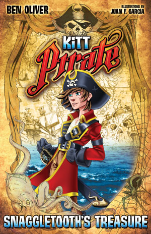
You may also notice from the cover that I have settled upon a pen name for the book. After much deliberation I have decided upon the name Ben Oliver. My wife and I felt that the name has a certain playful quality and a good ring, so we thought for children’s book it may be a good choice. So, there you have it. Let me know what you think of both, the improved cover and the name.
This cover is much, much better. But putting the author’s name on the top left doesn’t seem right.
Yes, I agree with John. The name itself is perfect but I’d like to see your and Juan’s name closer together. Thoughts are:
1) Maybe one above the other in a block so a reader’s attention can focus on that block of text. And in a different place. But that requires some major rework on positioning of the rest of the cover. Hmmmm.
2) I’ve just been through my graphic novel collection and there is a common element of having the names across the top, like a banner:
Ben Oliver * Illustrations by Juan F. Garcia
You can still keep the relative font sizes, if you wish, but that wouldn’t require as much rework and will still give one element that the eye gravitates to, rather than splitting the attention among two. And, as a side benefit, you could make that line bigger! 🙂
Somewhat like Kaz’ suggestion, but I’d put the two “illustrations by” “JUAN F. GARCIA” lines underneath the “BEN OLIVER” author line to make a block in the upper left, leaving the upper right clear. (Same fonts and scale, etc.)
BEN OLIVER
illustrations by
JUAN F. GARCIA
good stuff
Shared your book on https://www.facebook.com/IndyBoostMobile
Nice work!
Thanks, James.
HI, I’ve just started a short book and I’m happy to pay for formatting services. Before I get too far into it, can you tell me if it’s ok to write it in mac word or mac pages? and any other tips so that I don’t screw up the formatting bit.
Tracey
Tracey,
You are perfectly safe with either of these software packages. Personally, I am a big fan of Apple Pages. It is mean and lean, which is exactly what you need as a writer. You don’t have to worry about the formatting part too much, because the process of formatting – when I do it, for example – usually involves taking all formatting from the word processor out anyway, and then reinserting it in a different format to guarantee its consistency.
Regarding writing software, since you are on a Mac, I would be highly remiss not to mention Scrivener to you – http://www.literatureandlatte.com/scrivener.html
I have used this software to write all 14 of my books and it is in my opinion by far the best software for writers. It keeps everything together in one place, you research, your notes, your outline, your manuscript, etc and allows you to easily create a workflow that is perfect for you. Give it a spin. You may just fall in love with it, the way I did.