The Things We Did on the Atari ST
When I started making computer games in 1983, an immense sense of wonder and exploration surrounded the discipline. It wasn’t a science, the way it is today, where entire college majors are dedicated to even specific disciplines within software and game development. We were mostly on our own, with a piece of hardware before us and very little documentation to show how it worked, what it could do and how to tackle certain problems. As a result, ingenuity and tenacity were as important traits in game developers as programming skills.
Squeezing more colors out of the Atari ST
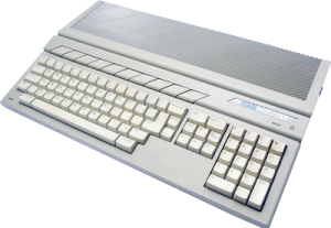
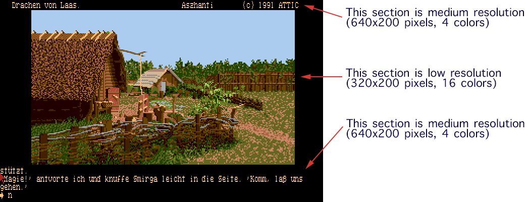
The Atari ST, which used to be one of my favorite platforms in the late 80s, offered a palette of 512 colors. However, in its low-resolution mode, only 16 of these colors could be displayed at any one time. In medium-resolution, only four colors could be selected. Not a whole lot when you consider that we can see about 7 million colors.
While working on my text adventure “Ooze,” I discovered a way to actually manipulate the hardware of the Atari ST in such a way that it became possible to circumvent these limitations and display many more colors. It was an approach that was unsuited for actual in-game graphics, though, because it brought the computer to a crawl—literally. For something like a static title screen, however, it was perfect and allowed the game to make a strong first impression on players with a title screen that was unusually vivid for the ST.
So, how did it work?
The first thing to understand is that on computers like the Atari ST, we were looking at a fixed hardware platform. Unlike PCs where users could have hundreds of different configurations of graphics cards, soundboards, processors, etc., every Atari ST was internally identical to the next, with the exception of available memory. This, of course, meant that if something worked on my Atari ST, it would also work on all other Atari ST computers, making this kind of experimental programming possible—and very exciting.
The Atari ST had a programmable video chip called Shifter. Through hardware registers, it allowed you to switch the screen mode from low resolution to medium resolution and to a monochrome mode, to adjust the position of the screen on the monitor, etc. However, Shifter and its associated Glue chip also contained a few more obscure registers that went further under the hood and affected things, such as the scanline timing, video synchronization, and so forth.
The key to displaying an image with more than 16 colors, was to, essentially, switch the color palette for every scanline, as the image is displayed. Assembly programming was imperative for these kinds of tasks because the timing was crucial. Oftentimes, with tricky tasks like these, you actually had to count CPU cycles and match it up with the sync signals for the monitor.
The process dissected
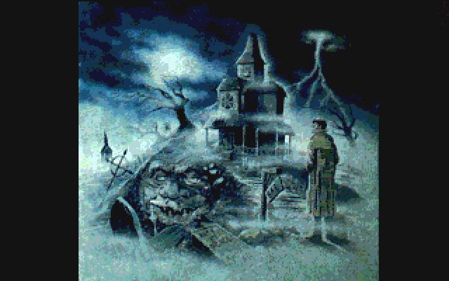
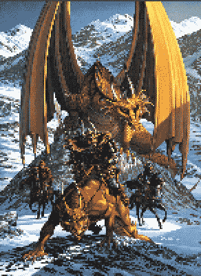
Let me break the process down for you in a bit more detail, taking the title screen from “Drachen von Laas,” a text adventure I wrote in 1988, as an example.
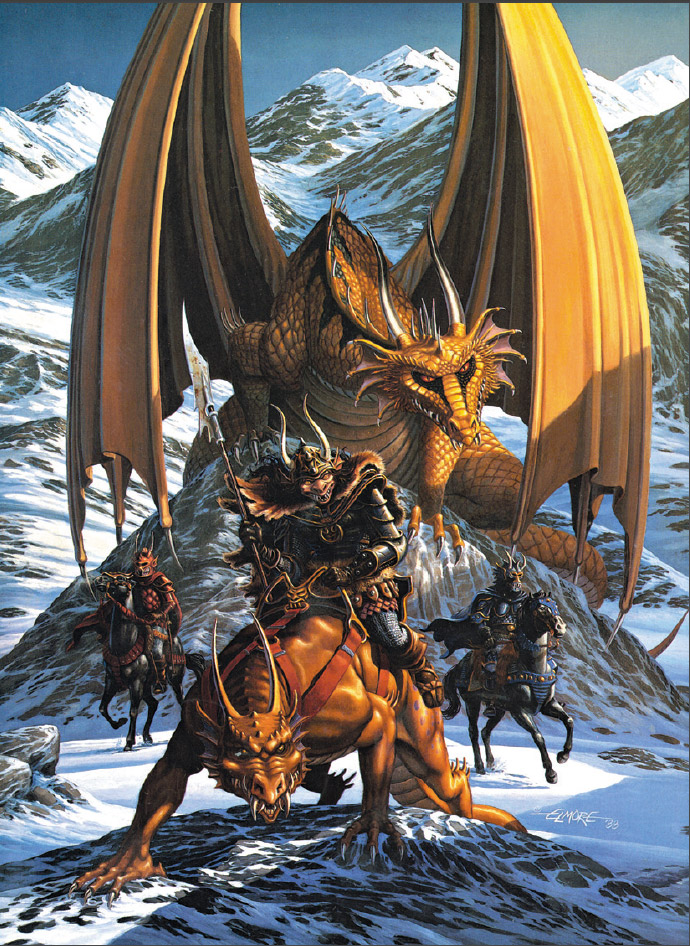
It all started with a full-color color scan of Larry Elmore’s beautiful cover artwork for the game. I should perhaps also note that scanners were not household items in those days and cost many thousands of dollars, so the scan was created for me by a professional reprography studio from the original transparency I had received from Larry. I no longer have the transparency or the original file, but just as a reminder, here is what the artwork looked like.
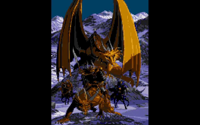
After scaling the image to the 320×200 pixel resolution of the Atari ST, the image would have looked something like this. As you can see, because of the low resolution, a lot of detail has been lost, but it still looks pretty good. (Note: I have doubled the image size on this page so it’s easier to see but left the actual pixel resolution as in the original.)

If we had simply taken this image and converted it to a 16 color palette, the result might have been something like this.
I am merely approximating here, but you will notice that there is a lot of pixeling in the image, as smooth color gradients are being replaced by dithering. Some of this could have been avoided to a degree by giving it a once-over by an artist, but you can see already, that the quality is nowhere near the original beauty, particularly when you imagine how this image would fill your entire computer monitor. There simply aren’t enough colors in the palette to create tones necessary to smooth out subtleties.
Since the Atari ST’s display resolution was 320×200 pixels, what I did instead was to take the full-color image and cut it into 200 individual lines. After doing this, I could now convert each of these lines and create an individual palette for each line. (No, I did not do this manually. I wrote a tool that did all the tedious work for me.)
The advantage for having a separate palette for each scan line was that this palette could be highly optimized for that particular line, whereas a general 16-color conversion would have optimized the palette across the entire image.

How does that benefit the image quality? Well, if you take the top-most line, for example, it contains mostly blue tones for the sky with a bit of gold for the dragon wings. Nothing else. There’s no snow and its many shades to consider, there is no need to worry about the shadows on the orc’s armor or the landscape, etc. The palette requirements for that one line are extremely localized and therefore allow me to reproduce more hues of blue, which improves the overall appearance of the sky, in this case. Let me show you this difference in an enlargement.

At the top, you see the line from the image in which the palette was calculated across the entire image, whereas the bottom one features the palette optimized for that one line only. It is clearly evident that the optimized palette creates a much smoother impression, reproducing the subtle color shifts, whereas the other one is horribly nervous.
With this knowledge in mind, the trick was then to tell the Atari ST to use a separate color palette for each image line. Easier said than done, but after a few days of experimenting, I had the problem solved.
Raster programming makes it possible
At first, the program would wait for a vertical sync, which occurred whenever the cathode ray of the monitor would reach the bottom of the screen and jumped back to the top. The program would set the color palette for the first image line at this time, by writing the respective color values into the respective hardware registers.
The program would then wait for a special hardware interrupt to occur that was triggered whenever the cathode ray reached the end of a line. As soon as that happened, the program would write the color palette for the next line to the hardware and then repeat the same steps over and over again for each line of the display until the bottom was reached and a vertical sync interrupt would trigger the process to start from the top again.
In the end, it was really that simple, but actually figuring it all out took some effort and creative thinking.
An even better trick
I used a comparable trick to create the cool effect in the text adventure games to add graphics. The approach was essentially identical to the title screen raster interrupts. At the top of the screen, I would switch the resolution to the medium resolution to display the game’s status line. After 10 lines I would then switch the screen to the low-resolution mode which gave me 16 colors for the graphics. Below the image, I would then switch back to the more text-friendly 640-pixel medium resolution mode for the gameplay parts of the game screen.
In theory, this sounds quite simple, but in practice, there were a number of hitches to consider. Timing. Interrupts have a certain latency, as the computer prioritizes its internal workings, and things like the horizontal interrupt would generally mark the end of the line, but only roughly. So, sometimes, the display would already be a few pixels into the next scan line before the interrupt actually occurred. Switching the resolution and color palette at this point resulted in nasty flickering effects that were completely unacceptable.
As the image data are sequentially fed to the monitor, the hardware keeps track, of course, which pixel is being drawn at any given time. In the end, the trick to stabilizing the resolution switch was actually fairly straight-forward. Once the raster interrupt was issued, the program would simply poll the hardware until the right-most edge of the current line was reached and then make the switch. So, I set it up that the interrupt was triggered in the line before I wanted the actual switch and then simply wait for the right moment.
Voilà! Just like that, my raster line interrupt became rock solid. There was no flickering, no visible artifacts, just a screen that used multiple resolutions at the same time. It was simply a thing of beauty.
The entire process required a lot of hardware interrupt management and masking because certain interrupts needed to be disabled to increase the overall stability, but had to be reactivated as soon as possible to prevent other tasks in the computer to fail, such as the keyboard, disc loading, and so forth. I figured out a good deal of this along the way by trying to visualize exactly what is going on inside the hardware and occasionally through simple trial and error.
Why didn’t the title screen flicker?
Observant readers may ask at this point, why didn’t the title screen flicker, when the color palette was switched on every scan line? Truth be told, it did, but it was not visible. Because the title screen was in a portrait format, it contained a large black border to the left and the right of the actual image. The flickering occurred in that area but since every pixel that was drawn was black, it became invisible. As long as I ensured that the palette for every line contained black as the first color, everything looked good. By the time the electron beam reached the actual image area, the new palette was safely in place.
I hope you enjoyed this little excursion into the history of down-to-the-wire programming we did in the ole days and I hope it offers a glimpse at the challenges we faced and how we overcame them by pushing the hardware to where it was never actually supposed to go.
Guido, how different was this on the Amiga? I believe Drachen von Laas was also released on the Amiga, but I’m curious about the graphics manipulation in general for both platforms.
This was much easier on the Amiga because it had dedicated video hardware. It even had a display mode with 4096 colors, called HAM. I used that for the title screen, which was very simple.
The resolution switch was also very easy. The Amiga allowed you to define how the screen is to be displayed with something called a Copper List. It was essentially a short script in which I could tell the hardware that for 10 lines I want this mode, then switch to the 32-color mode and then switch again at some other point. It was all very straight-forward and no trickery was necessary at all.
That’s very interesting, thanks! In that aspect, it seems more advanced than IBM PC compatibles? I don’t think PCs could ever display a different mode on a specific number of lines or section of the screen
In a silly twist of fate, my love actually goes towards the 16-color pixellated image rather than the line-by-line crafted one. And it’s not just about nostalgia – the end-result image loses a lot of texture. The pixellation for example created an unintentional imitation of scales on a dragon skin and left the sharp, jagged rocks as still being sharp and jagged. The drawback of using the color extension was smoothing out all this detail.
This for me means, that images for the improved render method should actually be very deliberately hand-crafted by a pixel artist, as the automated conversion simply lacks human sensitivity.
But I love the article nonetheless and all the trips into intricacies of making things work in “ye olde days” excite me more than a modern gamedev studio blog would.
Well, you have to remember that the images above are only approximations to explain the process. The real images looked quite differently, because the Atari’s color palette was very limited, to begin with.
In addition, the idea was not to make it look one way or another. It was to reproduce the painting by Larry Elmore as accurately as possible. I would not have wanted to add scales to an image where there were no scales, to start with.
To make matters worse, in those days, I did not have easy access to any artist who could have worked over the image. For the most part, the game was a two-programmer effort with one remote artist supplying a few images to fill in some of the gaps. 🙂
I’m sorry, but I’ll have to wholly disagree with much of the above.
For one the approximation is extremely accurate – I checked two independent sources for the original image and the one key difference is that actually the original titlescreen has a crisper palette than the above reproduction. However it is also very close in terms of the smoothing of edges – so close, that I wouldn’t be able to distinguish the two on a blind test.
The second point is really just a nag, not really an argument: the dragon on the original painting does have scales 😀 But then again – the foreground beast does not, so it might have been what you pointed towards.
But yes – given the limited manpower involved indeed it would have not been possible to get further revisions of the title card. Which just goes to show how different it was back then and how interesting the stories from that time are.
What you are completely ignoring is the fact that the Atari ST had a very limited color resolution. Unlike today’s 24-bit RGB images, the Atari ST had only a 3-bit per color resolution, making smooth gradients virtually impossible and you often had to contend with off-colors to approximate the effect. As I pointed out above, the images I show above are only for illustrative purposes and not at all representative for what they truly looked like on the Atari ST.
Hi, this was a most interesting find! I’ve played Ooze on the Atari ST and also own a copy 🙂 Fascinating game with a comical twist too I thought. Great adventure 🙂 Hoping you check out my humble ST website, thanks Guido for making this!
https://ataricrypt.blogspot.com/2020/08/ooze.html