
The Emperor’s new Clothes
Occasionally it seems we all are apt to ignore even our own recommendations, somehow too occupied with what we’re doing, I suppose, to stop for a moment and analyze where we are.
Book covers are my case in point today. As many of you may know, I have talked about the importance of strong covers on numerous occasions on mailing lists, message boards and blogs, including Self-Publishing Review. At the same time, when I submitted my books to scrutiny on J.A. Konrath’s blog a little while ago, it became evident that my own covers do not quite meet the criteria I had set out for others. Or maybe they did, but they did rather put my books into too small a niche to become successful.
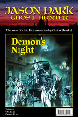 Here is a look at Demon’s Night, the first Jason Dark supernatural mystery I wrote. When I first published it in December 2009, I deliberately recreated the look and feel of the traditional dime novels I grew up with. I expected the print market to be my main outlet and in print, these covers work beautifully with their rich cover artwork and the unified layout the suggests a series.
With this being what they are, just as I released the book, the eBook market exploded and within months it became obvious that print is on its way out, while the Kindle and Nook now generate the majority of today’s book sales, particularly when you’re not published by a New York publishing house. While this is, of course, a very desirable development as it cuts down on production costs and increases revenues, I soon found that it also changed the way I had to approach the presentation of my books.
Some time last year my wife and I redesigned the covers in response to those changes in the marketplace. We needed to make sure that the covers work on computer displays, particularly as very small thumbnails. To accommodate that requirement the updated covers zoomed in on the key feature of the cover artwork and got rid of all the ancillary details, including the series logo and any unused space.
 Here is a look at the updated version of the cover Thu-Lieu created specifically for the eBook market.
I liked these improvements quite a bit but I ignored one fact in particular until a number people pointed it out to me in plain English. The covers still looked “pulpy.” This, of course, has been my desire all along but as my friend Scott Nicholson put it to me, “There is a reason the pulp era ended.”
Wham! Can you say wake-up call? The funny thing is, that this was nothing new to me. I knew that, naturally, and I knew the risks going into it the way I did. However, what Scott’s remark did, along with the comments of some other people, was to remind me that it simply might be necessary for me to “unpulp” the look of my books to find an audience. While people may not mind to read a pulp-style novel, trying to sell it to them with a pulp fiction cover simply may not have helped my game.
Willie Meikle might be a perfect example of this. He is the master of modern pulp in many ways, and he sells very well. However, a quick look at this covers show us that his books look every bit as slick as any other authors. Aha… some cogs began to spin in my head.
Fortunately, in the digital world changes are easily and quickly made, and it is possible to evaluate the performance of a book cover fairly easily. With that in mimd I decided to try and take my books in a completely new direction and see what will happen. Time will tell if all of this is right or if this is just another harebrained attempt, but in all honesty, I do feel good about this.
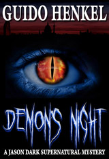 For the past days I have labored over the redesign of the cover for “Demon’s Night” and you can see the final result here.
So, what do you think of it?
It may look simple, now that it is completed, but it took some time to get to this. My first attempt at a new cover was uniformly panned by my wife and friends as still being too pulpy. I was hitting a wall and just could not get past my i initial concepts. It was only when I decided to completely forgo the original cover artwork that I finally felt some fresh ideas surface.
From there it became a very iterative process of trial and elimination. I tried different fonts, different colors, different layouts and spatial arrangements, different font sizes, different color themes and so forth, until I finally ended up with the cover you see above.
I am sure you will agree with me that no longer does this look like a pulp story but like a horror story. At the same time I tried to retain a bit of a series character by using a dimmed version of my London skyline, which also conveys the setting of the book.
Best of all, however, this cover works wonderfully as a small-size thumbnail, which I think is crucial to generate interest on sites like Amazon.
I am eager to see how this cover will perform. Combined with a new product description and a clear “Supernatural Mystery” moniker in the title I am hopeful that the book will now be able to carve out its proper space in the market. If things work out, I will redesign the other books in a similar fashion.
You can now find the new version of “Demon’s Night” on Amazon.com, Barnes&Noble, Apple’s iBookstore and other retailers for only 99 cents! Hey, I even updated the Smashwords version, which should go a long way to show you how dedicated I am to these changes because ordinarily I don’t do anything on Smashwords any more.
Clearly, there has never been a better time to check out one of my books, so please feel free to grab a copy!
As an illustrator – I hate to say it – but I think it’s a good design. I mean, I’ll always vote for more picture in my picture because, hey, I like pictures. But I can see how a strong, iconic graphic like that is going to be very readable as a thumbnail online. The only thing – you’ve kind of ‘shot that bolt’ – the eye in the center of the book is so graphic – you won’t really be able to do the same thing again 🙂 It’s like ‘one for free’. I mean, there’s the Hand in the center of the page, the Skull in the center of the page – the Crown in the center of the page (see how it might start to look a bit ‘generic’ if overused)….eventually you run out of these ‘bullseye” solutions 🙂 But yes – Good job, much improved! Looking forward to hearing how it performs for you.
Marc, you are absolutely right. It will be a challenge, but maybe I can tweak the design for the other books slightly in such a way that it maintains this same feel without always going entirely for the bullseye effect. I’m currently mulling around the cover for “Theater of Vampires” in my head and we’ll see how that turns out.
I’m not a writer but follow Konrath’s blog because I’m fascinated by all the changes in the publishing world. I didn’t comment on your post over there as I didn’t feel I would contribute anything meaningful, but I have to tell you I LOVE the new cover. And I can’t tell you how much I hated the old one. I never would have clicked on the old one but this one is great and will show well as a thumbnail on Amazon, ereaderiq, other blogs, etc. Way to go!
However, maybe you can remove the exclamation points in your product description? They make it kind of hokey. I find myself reading it in that dramatic movie trailer voice in my head and somehow that makes it less appealing.
You removed any reference to pulp on the cover and in the description but yet the first sentence on the product page is a review that says ‘A briskly paced pulp fiction…’. WTH? If you’re trying ‘unpulp’ it screaming it out on the first line doesn’t help. Maybe remove the reviews at the top and only leave the ones at the bottom after the product description since they are duplicates?
Good luck – I hope you see a big increase in sales with your new cover/description. Break a leg, as they say! It would be great to get an update over at Konrath’s site after some time has passed.
Sandy, thanks for your thoughts. The reviews at the top of the Amazon page will go away as soon as Amazon gets around to it. Sadly I have no direct control over that but it’s been almost three days already since I requested removal, so they should go away any day now. 🙂 Once they are removed, this should take care of your concerns.
An update on Konrath’s site is coming later this week. It’s as if you can read minds.
I think that the new “eye” cover is very strong and will catch a lot more attention than your original or second ghost driver cover.
Personally I think the whole pulp thing is a non-issue. I do not think that the average reader knows or understand the pulp tradition. They only thing that they care about is if it a good story.
I think that you will see an increase over the next few months.
Eric, that was actually my thought when I initially published the series over a year ago. I thought it would actually bring kind of a “fresh” element into the mix, as people had not seen this kind of presentation in quite a while.
However – as much as I personally like it – I now believe that perhaps the look is simply not contemporary enough for people to connect with it. But then again, what do I know?
I think that we are all making this up as we go. 😉
Hahaha, yes, I agree, Eric.
Smart reasoning. It takes a lot of courage to change one’s mind and long-established conceptions and take a fresh look at everything from the ground up. Even below the ground. I had a challenge at it myself. Good job and good luck.
Scott Nicholson
I, also, was one of the people who did not like the original covers. The character seemed to be too obviously (dare I say it?) a rip-off of the 1927 Lon Chaney film, “London After Midnight,” and actually put me off.
The new cover is great.
I like old covers, but the new one does seem more like what’s being done out there these days. I have a hard time with the cover art aspect of this whole indie e-publisher gig because I don’t have much of an eye for that sort of thing, and I’ve gotten “love the cover” and “hate the cover” from people in regards to the same cover, heh.
Good luck with the new version!
Interestingly enough, so far, the results from the overhaul are zilch. Despite the lower price point, the new cover, the new description, etc. I have not sold a single copy more than I did before. The only difference I see is that instead of making $2 a copy I’m now making 37 cents for each copy I sell.
I think that it’s a little early to tell how the new cover will impact things.
What size image seems to thumbnail best? I tried 600 x 900 pixels but when anazon converts it to a sample thumbnail I can barely see my image. Anything larger seems absurdly long. Any suggestions? Im working in photoshop cs 5
I usually use images 600×800 pixels that I upload to Amazon for conversion.