Oh no, it moves…
 After a lot of the talk about some of the basics of the game, I thought it would be nice to have Marian discuss some of the work the art department has been doing on their side of things. So without further ado, here is Marian with some shop talk for you. I’ll be back next time with more info for you.
Hey folks! We did it! The first monster is in the game! And it looks… well… unhealthy. As it should.
I want to take you behind the scenes for a bit and talk about the creation of this monster, but since you can easily read almost everything about the steps normally taken by modelers on a site like www.zbrushcentral.com, I won’t go too far into the boring details.
With our first dungeon sets finished, we noticed that pretty soon we would need something that moves around in these labyrinths, so we can play around with it, and test the game mechanics within. At this point we already have lots of ideas for cool enemies and monsters scribbled out for the game, but to fully flesh them out, design them and then build them in high quality from scratch will take quite some time. Usually you start the modeling process with a scribble that you draw or receive from your conceptual artist that defines how exactly the creature should look like in the end.
Unless, of course, you already have a clear vision, in which case you would simply set yourself loose and begin modeling the creature straight away with Dynamesh in Zbrush. Alternatively, you could just fool around with Zbrush long enough until you managed to produce something decent out of it. Each approach may work, but more often than not, the approach artists take begins with the scribble. Since nothing about Deathfire is truly ordinary, our case was an exception, of course. 😉
I recalled that I had the concept for a monster lying around in a backup somewhere. It was a monster I had thought of about ten years ago but never had the chance to actually use it. I had begun to model it back then but never got further than doing a basic few tests and getting the proportions in place. For me, it was the perfect starting point. I went back, loaded the model and began to re-imagine the creature, skipping the scribble stage entirely.
Don’t be disappointed, though, I created one nonetheless… just for you… after the fact… which is a whole lot easier by the way, because you already know exactly what it looks like.
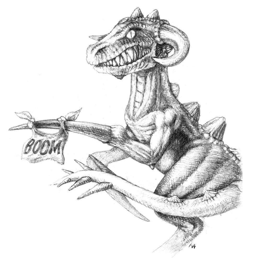
Once I had the scribble, I jumped straight into 3DS Max and took a closer look at the old model I had created… and realized that not only were the proportions wrong, but also just what a mess this 10-year old mesh structure actually was. Time is hard on digital content as technology is virtually a runaway train and can change requirements overnight.
I knew I could load it up in Zbrush and give it a complete overhaul but it would be a lot of work. Still, it would still be faster than building it from scratch, so I fixed all the bugs and reworked it, creating an entirely new surface for it, while also tweaking a lot of the proportions. When it was finished I showed it to Guido and André for their suggestions and reworked it once again according to the feedback I got.
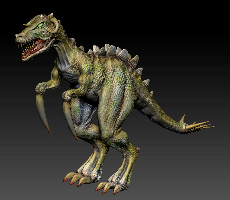
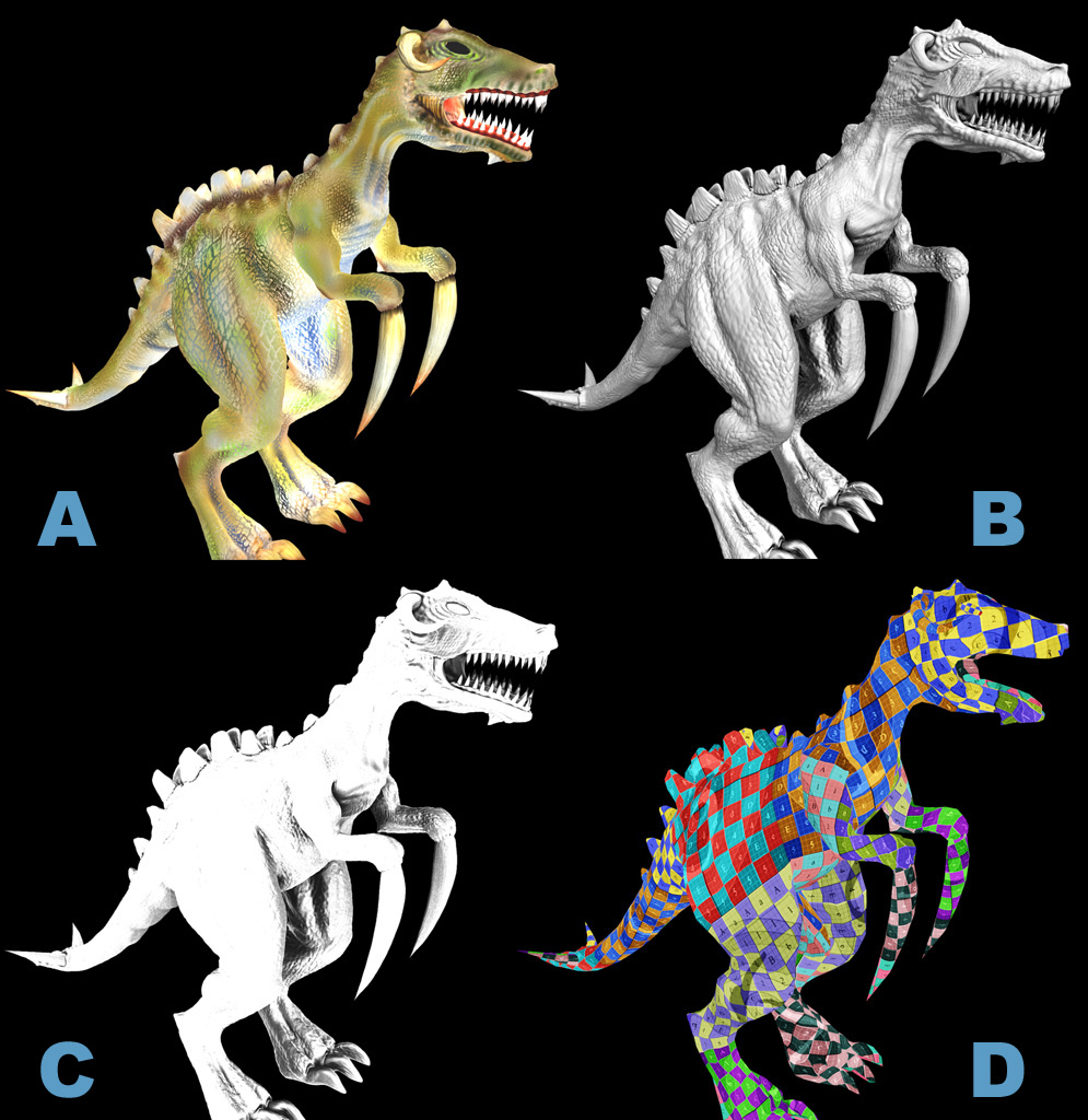
Once it was completed, I exported everything to 3DS Max rendering out proper skin colors (Fig.A), the depth information for the normal map (Fig.B), a shininess map and the ambient occlusion rendering (Fig.C). All very technical stuff but very necessary to create a polished model.
That should be it, right? One would think so, but the fact of the matter is that models coming out of ZBrush have an incredibly high level of detail. Too much for game engines to handle, typically, and the next step in the pipeline was for me to create a version of the model that has fewer polygons.
I built a completely new low-poly model that was based on the new high-poly version, and while doing so I got to do the job every artist loves to do the most… (In case you have not noticed, I am being sarcastic right now.)
If you are into puzzles and brain teasers, you might actually enjoy unwrapping UV texture coordinates, but it is every bit as tedious as it sounds. Honestly. Try to distribute the space on a texture as evenly as possible over all the polygons of the model, eradicating the texture from stretching or being pulled in the wrong direction. Remember, the texture map of an object is like a skin, essentially, and if you tug and pull on one end, invariably, it will affect the rest of the model. Tweaking the points where the texture is attached to the wireframe model will help minimize the impact, but is a process that is incredibly time consuming and not a whole lot of fun. We might be making games for entertainment, but the work that needs to be done to get there can oftentimes be testing your patience and become every bit as mind-dumbing as any job.
It is possible to speed up the process using some functionality built into today’s software, such as relaxing the unwrap modifier, but there are still lots of minute details that you just can’t fix except by hand. And even then, there will always be some glitches that will keep you going back over and over again. The process is actually so boring that I prefer to listen to TV shows or Audiobooks during the entire procedure. That way, you get some head space and you don’t get itchy while checking all the polygons for hours and hours on end, until you found the optimal solution that gives you the (hopefully) least wasted texture space (Fig.D).
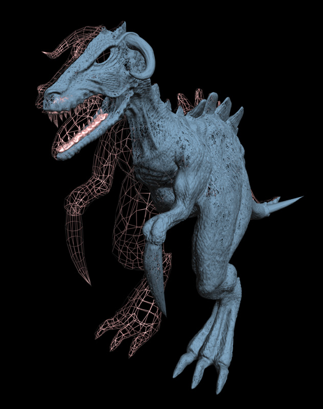
With all that out of the way, the next step is to check if the proportions are still the same in both models. In the case of our critter here, I bought the model from 9 million polygons (high poly) down to 9 thousand polygons. Not a bad reduction at all. You can see the difference here in the wireframe models (yes, the right half of the model is a wire frame too. It is just so dense that it looks like a surface.).
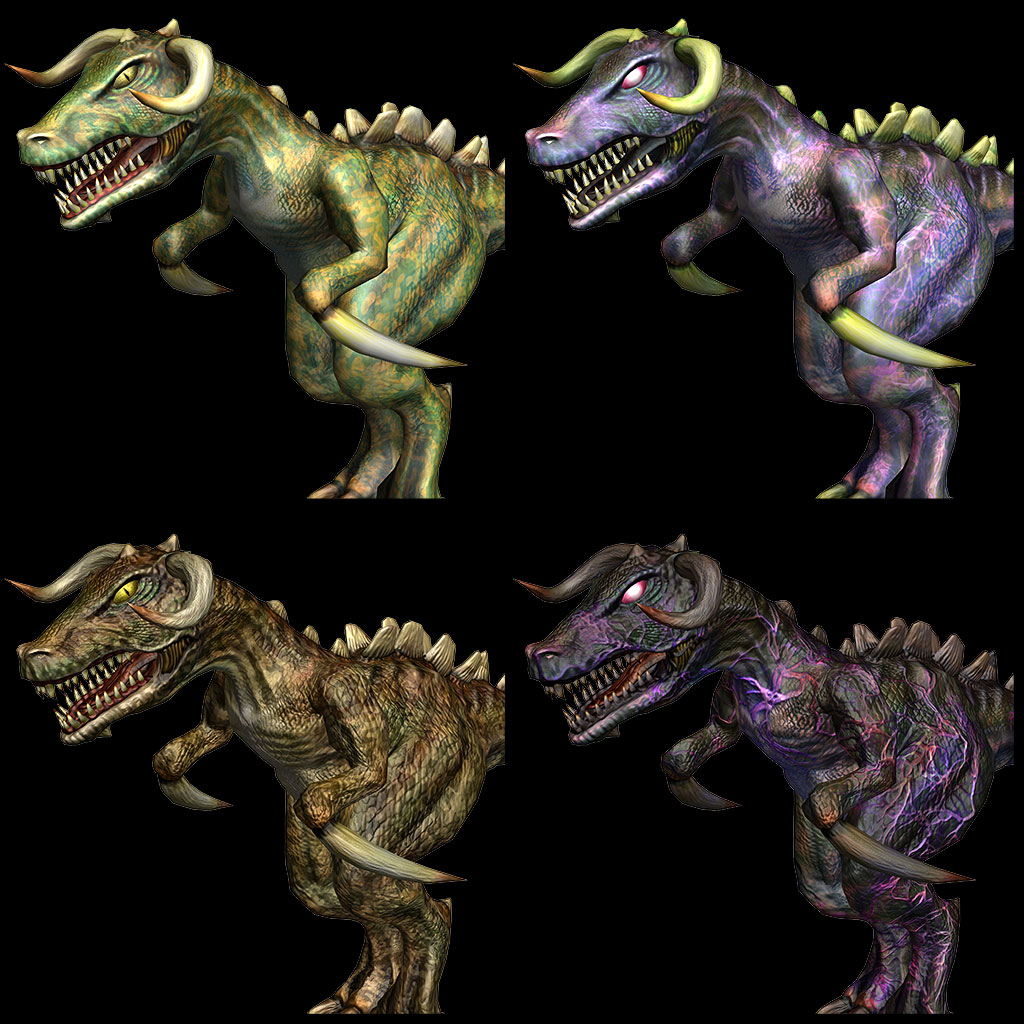
With all the details rendered to a texture, I am loading the textures into Photoshop and begin layering them on top of each other until everything is perfectly fine-tuned and I am happy with the results. At this stage, I always find that getting input from your colleagues is the best source of feedback at this point, in order to get the details right. It is all too easy for myself to get lost in the wrong details, and a different set of eyes always provides a new perspective, pointing out things I may have overlooked or became too complacent to care about. This kind of feedback is often the source of good ideas, as well. André was my second set of eyes in this case and together we tweaked the textures to get the most natural or — in case of our undead friend here — the most scary look out of it. I think it is easy to see the improvements in the following image.
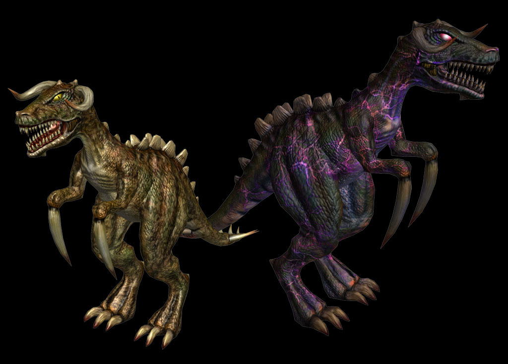
I have no doubt that we will still have to continue applying minor tweaks as we go along and utilize the model in our Unity environment. But for the time being, the Daggerlisk is complete and exported. Time to move on to some of the other denizens of our world, most of which will not be drawn from the animal kingdom, but lean more into fantasy lore.
That’s it for this time. I hope you like that you’re seeing.
Marian
P.S. Oh, and yes… it also moves…

Very interesting post.Thanks Marian.
Hard to believe you have to reduce the quality of the 3D rendering from 9 millions polygones to 9k.How more beautifull the Daggerlisk would have been!!!
“Courage!Let’s flee!!”
Fortunately for us, it can’t fly!!!
Nice, looks great. The undead will rule Deathfire. 🙂
Absolutely loved the entire story behind the making of this creature. I cannot wait to hear and see more. The process is utterly amazing of what it takes for one tiny idea to come to life. Thank you for sharing it Marian!
It was also an honor to take part in the focus group. I really really enjoyed taking part and helping in any way I could to make Deathfire an old-school gamer’s dream.
Keep up the great work and thank you for sharing with the community!
Looking forward to a speed buffed Daggerlisk chasing me down a hallway. <3