A first look at the user interface
Before I get into the next Development Diary entry for Deathfire, I wanted to point you all to a new interview with me on The Nerd Cave. It is an interesting – I think – look at the different aspects of my career, not only the games most people are familiar with. But now back to our regularly scheduled programming… more Deathfire stuff. 🙂
 It is a common occurrence in game development that you have to make design decisions based on incomplete information. Why? Well, because at the time you design many aspects of a game, the game itself does not really exist yet. You are merely projecting what you want it to be. Therefore you have to make a great many decisions based on whatever information you have at the time, and what you expect the gameplay to be like in the final product. It is probably hard to imagine for many people, but game design is a very iterative process. Especially as the complexity of the game and underlying systems grow, the requirements will most likely change as well. Somewhere down the line, play testing may show flaws and weaknesses that will have to be addressed, or entire parts of the system show themselves to be flawed, tedious or outright un-fun. No one has ever designed the perfect role playing game in a single attempt, ever. You make decision, rethink them, revise them, reiterate them, adapt them and then repeat the entire process until one day you ship a product.
While working on Deathfire, the other day we stumbled into such a scenario, which I think illustrates this very nicely in an easy to understand manner. The item in question were the character status boxes.
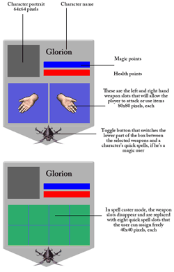 These small user interface elements serve to give the player a quick overview over the characters in his party, their health, their mana, their condition, etc. They also allow the player to access more information and to make various character-specific selections, such as attacks and spells, among other things.
I made a list of components I felt needed to be part of this character box, mocked it up very quickly in Photoshop, and forwarded it to Marian so that he could think of a proper graphical representation for them. Instantly the question for him became, “Should we do it this way, or maybe make tall slim boxes, or rather wider ones?”
He worked out some ideas and showed them to the rest of the team. You can see the initial designs below. As you can see, they follow the same kind of general design pattern, but each version is created with a specific focus in mind. One focuses on the portrait, while another one favors the attack and spell slots, and so forth.
Once we saw these, it became clear that with our original premise, these boxes would use up a significant amount of screen real estate. Deathfire will have a party that consists of four heroes. In addition to that, the player can recruit two additional NPCs at any given time, resulting in six character boxes on the screen. With all the information displayed, this a not insignificant amount of screen real estate to deal with and the last thing you want is for these boxes to cover up vital areas of gameplay.

First versions of the character status box that we evaluated
While these were great first attempts, they felt a bit too design heavy and not what you would really need in the actual game. In addition, the important elements seemed to be drowned out a bit by the bulky borders and decorative elements. In a word, we felt we weren’t quite there yet. We decided that we needed to optimize this somehow and for that we needed to envision more clearly how the player is going to play the game. While we have the game engine up and running with our 3D environments and some basic core functionality, we have yet to reach the point in our prototype where it is possible to really get a feel for the way the game will play in the end. Therefore, we had to extrapolate and sort of play the game in our minds, and as we did so, a few things became obvious.
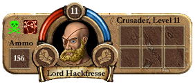
An iteration of the character status box, but we felt it ran too wide.
Note, however, the lines are all much slimmer than before.
This is not final art and the portrait is merely a mock-up
There was a lot of stuff in those original character boxes that we didn’t really need. At least not all the time. So we thought that maybe we could create boxes the display the minimum of information and when the player moves the mouse over them, each respective box will expand to its full size, allowing access to the full set of features. The next step was for us to decide what that minimum of information actually is that we need to relay to the player at all times.
 Do you really need the character’s name, for example, all the time? One could argue that the portrait is enough, particularly if we allow players to customize them the way we have in mind, but since we are creating a game in which interaction with NPCs and among the party members themselves will be very frequent, we felt that it is, in fact, very important that the player always has an indication as to who is who, when they are being referenced by name.
But what about those attack and spell slots? Because we have a turn-based combat system in Deathfire, it is not essential for us to give the player instant access to his weapons and spells. In real time combat, yes, the player needs access to his weapons, which represent the attacks, within a fraction of a second, but in real-time combat, the combatants take turns, which means there is proper time for the player to make his selections without rushing things. If we automatically expand the box for the character whose turn it is, this should turn out to be pretty slick and efficient, actually, also serving as a visual guide as to whose turn it is.
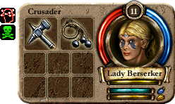
The expanded character status box with weapons equipped.
Note: This is not final art and the portrait is merely a mock-up
Usually the on-hand weapon slots also serve the purpose to Use items in role playing games, such as potions or tools. However, we reckoned that while that is true, it is not an all too common occurrence, particularly not one that is typically time critical, so the brief delay that expanding the full box would incur during a mouse-over should be acceptable. There is also still enough meat for the player to grab the box and drag it to a different place so that the order of the party can be easily arranged in the game, while mouse-over texts will relay additional information, such as the actual points of health, etc.
In my original layout specs, we also had a small toggle that allows the player to switch between a panel displaying the equipped weapons and one displaying the hero’s quick-spells. (Quick spells are memorized spells that can be fired at a moment’s notice without further preparation. They are complemented by non-memorized spells that require significantly more time to cast.). Upon playing the game in our minds, we realized that this toggle, too, is really needed very infrequently. For the most part spell casters would want to have their quick spells accessible while melee and ranged fighters would want their weapons accessible. The player would then occasionally switch these panels, but for the most part we expect them to remain fairly static settings.
Therefore we decided the toggle does not need to be available at all times and could be safely removed from the mini box. Incidentally, as Marian was working out his designs, it turned out that we do not need the toggle at all, because we can fit the weapon slots and the quick spell slots all on the enlarged pop-under box.
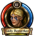 With all that in mind, we decided that we really just wanted to display the portrait, and the health and mana bars at all times, along with the hero’s name and a small digit that represents the character’s level. Character states, such as poison, paralyzation, etc can be easily color-coded into the portrait, or displayed as mini-icons alongside, and damage markers can be painted right over the portrait. All in all a pretty neat affair, I would say. For now… because who knows? Once will begin actually playing the game in earnest, we may find that our assumptions were wrong and that have to re-design the boxes once more, but such is the life of a game developer. It is the nature of the beast. Game development is an evolution, even after doing it for the umpteenth time.

A very juice update indeed!!
I recently discovered your webpage ( thanks to the forum, of legend of grimrock) And must say that i REALLY like the way you design RPG´s.
I have always liked games like EOB and DM ( Although i was terrible playing them) , and it´s great, that there are still people that think, this kind of games can be reimagined and improved.
Thanks ! you just gained a new fan! 😉
using potions not time critical? Hmmm… is that a hint as to a design goal? As in, potion chugging won’t be a frequent affair?
Opening the panel takes 0.2 seconds and I hope it will be quick enough for pretty much all needs. Since we’re not having real time combat, immediate potion jugging will be necessary only when environmental effects or story elements damage the player. It is unlikely that in those instances time is truly of the essence to the degree that 0.2 seconds will not be enough.
I see. But didn’t you plan on going real time (“get in the face” of players)?
Yes, like Sacred_Path, I thought there was some mention of real time in your earlier blogs too, is that something that has changed on further consideration?
One request I have would be to make the UI left hander friendly. If you are using vertical bars such as character icon bar then it would be good to have the option to dock it on the left hand side of the screen, for instance. Some recent games (Grimrock, for instance) have been pretty inconsiderate to those who use a mouse left handed. The fully reconfigurable GUI in the Wasteland 2 demo video, looks pretty impressive IMOP.
Nothing has changed, a mixed model has always been what we had planned. The real-time element is limited to the environment as such – that’s where we want to get into the player’s face. As you walk through the game, things happen in real-time, but as soon as you switch to combat, it will switch to a turn-based mode for the duration of the fight.
From what I got, this will be a Realms of Arkania style game. Which means turn based fighting but step wise real time moving in 3D environments.
Btw, chuckles have been made reading Lord Hackfresses name 😀
This is the first game which got me interested after playing Wizardry 8 (a decade ago). Also I like the style of the mocked up artwork and character portraits, as well as the fact, that it will be a mixed model in gameplay. Looking forward to new updates 🙂
I’ve been quietly reading all your update posts and did want to finally chime in and say I’m grateful for your behind-the-scenes discussions, and really encouraged by both the design philosophy you’re exhibiting and the art direction — I’m really liking what I’m seeing here! Keep on this path! 🙂
You mentioned a 0.2 second delay on mouseovers, and I thought it might be worth suggesting that you make this user-configurable for the final product. Most gamers are happy with sensible defaults, but a sizable minority of us really appreciate being given as much customizability as is sensible, especially with UI matters like responsiveness of popups and mouse pointer speed and so forth.
This is a total aside, but you mentioned status effects showing up on character portraits. Can I just suggest that you please provide lots of tooltips or simply come right out in the UI and spell out what these effects are, rather than rely on gamers intuitively understanding (or memorizing) lots of little abstract symbols? Strangely enough I’ve encountered this lack of visual information even in modern-day RPGs — I’m in the process of finally playing through The Witcher 2, and one thing that really astonishes me about the game is the almost total lack of tooltips, prompts, or textual information in almost any of the interface screens (like inventory and journal). Many of the icons are impossibly cryptic, and there is no onscreen info that shows, for instance, that you have to hit spacebar to read a document in your inventory (nor is there a mouse-based alternative). Bizarre for a modern-day game! Obviously I’m not assuming you had any intention of doing something like this, but I thought this was worth mentioning now since I suppose it pertains to character portraits.
Anyway, looking forward to the next update and more insights into this exciting project!
Raphael, thank you for your comments. It is funny you should mention it, but we have tooltips all over the place, especially in the UI. If you hover over the health bar, for example, you will get a display of the exact points – like “Health 5/10”. The same goes for the Mana points, and if you hover over the experience point bar it will say “1024 experience points to next level”, while the hunger bar has a tooltip that says “Hunger 25%”
So, it would seem we are on the same page here. 🙂
Very nice insights into your design process, thank you for that. I’m really enjoying being able to follow Deathfire’s development at this stage and to even feel listened to and one’s opinion taken seriously.
That said, I wonder why you think it is important to see the level of your character at a glance all the time like that. I’d expect my party to level more or less collectively, and the raw number of their levels not offering me much help in most decisions. Encumbrance, stance, character states or a lot of other information would seem much more useful in this spot.
Hello Guido,
I have been following the Deathfire project for a bit now and am having a total blast watching the processes unfold before my very eyes. It is exhilarating to say the least.
I can see why this part of the game interface is so important. Having played the entire Wizardry series starting back in ’82-’83, Squeezing maximum character feedback into the screen character slot is MOST IMPORTANT!!!
IMHO (Using the latest mock-up): Using circular health and mana bars wastes quite a bit of spacial opportunities. Here is my suggestion on the character onscreen info layout to maximize what I think the game needs to provide the player at all times:
Starting on the right side of the panel I would use vertical health and mana bars right next to each other. The character portrait next to the bars but framed in a diamond border. This frees up four areas around the portrait for multiple uses. I agree with other posters that individual character level numbers are not really needed. Make the player go to the main character sheet. Why? Simple….these are the people you need to know everything about. The more you have to go into the main character screen the more intimate you become with each of your characters. With those starting tweaks many more options become available without using more space. If done this way it is possible to gain space I would think.
Good luck and love the work immensely. And thank you again for letting us see inside your world! 😉
So much potential but please keep going By: Streakist – Dec 8, 2009Version: 1.0Don’t listen to people that say it’s too hard to do spells, they are doing it wrong. With a little practice you can do any spell easily.Dueling is super cool but needs the following fixes/improvements. 1. Defensive spells – Currently there’s no reason to use any defensive spell besides “protego”. It works on anything and can bounce most spells. “Aguamenti” and “finite incantatem” need a bump in power to make them useful. I suggest making “aguamenti” the ONLY spell that works on fire spells, and make it hurt the oppontent sometimes. I think “finite incantatem” could be improved if it would cancel “episkey”(currently unstoppable).2. Disabling spells – They don’t seem to disable. There’s no reason to not spam “Confringo” as it clearly does the most damage while the disabling spells (“stupefy, “petrificus totalus”, “expelliarmus”, “oppugno”) just do less damage and don’t really disable the opponent. When you lose your wand you should have to do something to get it back, perhaps have it bounce around the screen and you have to touch it. When you’re frozen you should shake the iPhone to break free. Care needs to be taken to prevent infinite spell juggles tho. Perhaps make it so you can’t do offensive spells when someone is disabled, but you could use the time to heal or something.3. Paper, Rock Scissors – Make it so each offensive spell trumps certain other offensive spells if cast simultaniously. If both players do the same spell make them bounce. This may take work to make sure it’s balanced. 4. Single player duels – The computer cheats. Casts spells in chains that are faster then a human can do. If you are good at defensive spells you should be able to block all spells on the Novice setting at least. Give some house points for single player dueling too, not everyone has a friend with a Jesus phone.This would be such an awesome game with these changes.