
10 Things Amazon should correct in the Kindle
I am a huge fan of the Kindle. Always been. I owned a first-generation Kindle and in my mind, the Kindle was every bit as revolutionary a product as the iPhone. A game changer.
However, as great as it is, even the Kindle is not perfect. I am not talking here about buttons being too small or somesuch thing. I am talking about the software implementation in the device.
Over the past two years I have formatted hundreds of e-books, as I’m sure you know. I have formatted books for NYT best-selling authors, for publishing houses, midlist authors and indies alike, and I have been able to study many of the idiosyncrasies of the ebook readers in the market close up.
The Kindle has a number of firmware bugs that have unfortunately not been corrected in its three-year lifespan or its three platform generations. At first I was always willing to admit that it was easy to forget that Amazon is simply not a software company but a retailer. So the experience pool is simply not there and mistakes happen.
As the competition mounts we can no longer be so forgiving, I suppose. Apple shows everyone how it is done with an ePub implementation on their iBooks platforms that not only lives up to spec for the most part, but extends it with significant improvements. Apple may drop the ball entirely on the store side of iBooks, but that’s a different story for another blog post.
I think, however, that Amazon can no longer afford to let things like these firmware bugs slide and should take steps to address them properly. Not only in the current or upcoming platform generations, but backwards also, to make sure all Kindle users enjoy the proper, highest quality e-book experience they are looking for.
Here is my list of 10 Things that Amazon should correct in the Kindle.
- Let’s start with a simple one. Image transparency. The Kindle supports PNG images but not the format’s transparency settings. Instead it renders the background white. This would be a simple software fix to correct the issue and could be done in a few minutes. In fact, it is surprising that this bug exists at all because PNG transparency is one of the image format’s most basic features.
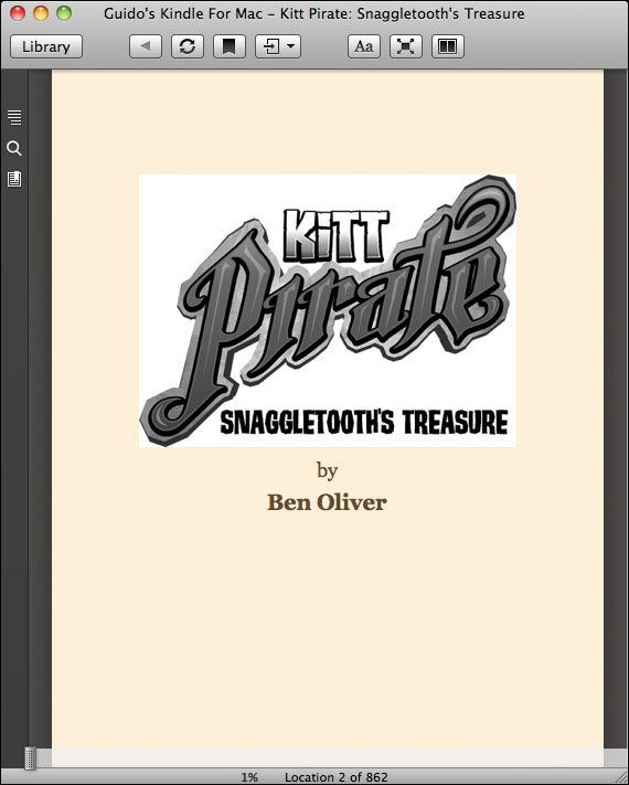
Notice how the background of the image is white against the sepia paper color, while it should be transparent.
Click on the image for a larger view - Em-spacing. As a book formatter em-spacing is the key to all good formatting, because it allows for proportional scaling of the content, which is key for applications in which text is free flowing – such as e-books.?Currently the Kindle miscalculates the size of em entirely, making it about 4 times larger than it should be. Proper formatting using em-spacing is therefore problematic on the Kindle and I am sure everyone agrees that spacing in pixels is unacceptable in a world where display sizes range from the tiniest cell phone to the largest tables and desktop screens.
- Margins are also a sore topic on the Kindle. Not only are margins calculated incorrectly as a result of the em-spacing error mentioned above, the Kindle completely ignores all margin-right settings. To make matters worse it ignores all padding-right information also. As a result it is impossible to space text properly in various occasions.
- Border properties are also ignored in many cases. Depending on your Kindle generation or software you may or may not see borders that have been created using the border style attributes in the e-book.
- One of the biggest issues, perhaps, is text justification. The Kindle does not properly justify text. Every few lines or so it will suddenly create a ragged line, throwing off the formatting. This is clearly a software bug that should have been addressed long ago but for some reason it hasn’t been addressed even though it is at the heart of the most basic function of the Kindle, the actual flow of text paragraphs.

Notice how the lines in the top paragraph are ragged when, in fact, they should be fully justified.
Click on the image for a larger view - Going along with this issue is the lack of hyphenation. While the Kindle software reader software support hyphenation, the Kindle devices do not. Now, I can understand that perhaps the dictionaries necessary to do proper hyphenation may be too large to fit on a Kindle or may be too processing intensive – though I honestly doubt it, giving modern software technologies – the fact that the Kindle does not even support HTML’s soft-hyphenation is really a disappointment. Hyphenation is integral part of text flowing and I am not sure why it has been so overlooked for all this time.
- Early generations of the Kindle also do not support tables. When at first the Kindle arrived and was used for novels mostly, this was perfectly fine, but as the acceptance of e-book readers grows, so does the diversity of the books, and, let’s face it, text and reference books need tables. There is always a need to be able to tabulate content, something the Kindle makes impossible. While the current Kindle generation supports tables, it is a feature that cannot be used because legacy readers do not. This feature should be introduced to the Kindle 1 retroactively with a firmware upgrade also to ensure uniformity across all generations.
- Another point of contention is object floating. The float property is not part of the mobi e-book specifications, but let’s face it, these specs are older than your last computer. Amazon has bought the company that developed the mobi e-book file format but sadly the development and extension of the format has completely seized, making the Kindle the only e-book reader with a completely outdated e-book format. Before you tell me that Amazon also allows ePub submissions at this point, let me remind you that Amazon converts these ePub files into mobi files before delivering them to users, stripping the e-books of all ePub specific features.?The float properties would allow text to float around images, giving us not only the opportunity to insert images into the text, but they would also make graphical drop caps a possibility at last.
- What is also missing from the Kindle is a way to properly deep link to other books in the Kindle store. Sure you can use a link to Amazon’s website and insert it into your e-books, but did you ever look what happens? The Kindle tries to display the Amazon website on its screen, rendering it garbled and virtually unreadable. Why not give Kindle authors the chance to link to page that has been optimized for the Kindle like the one the Kindle pulls up when you search and purchase a book directly on the device.?I cannot tell you how many emails I have exchanged with Amazon on this subject but for some reason the support staff does neither seem to understand the issue, nor care much about it. I was continually referred to use either regular Amazon web links or some XML links that the Kindle could not even interpret properly.?Since upselling more books would be in Amazon’s interest every bit as much as in the authors’, I am flabbergasted at Amazon’s disinterest in providing such a specialized deep link.
This is what a deep link to the Amazon store looks like on the device. Not very useful, is it? Most of it is not at all readable.
Click on the image for a larger view - Last, but not least, Amazon should spend some time to make sure the software versions of their readers are actually representative of the devices. They do have the best software readers out there — don’t get me started on the Nook software reader that can’t even center text and will crash in 9 out of 10 times — but the way a book looks in the reader is not representative of the device at all? Why is that? Just use the same fonts, the same firmware routines and things should look identical. It is called code portability and I’ve done it for 10 years on cell phone games, making games look the same on hundreds of different phones.


As you can see, these are some basic flaws and it is surprising that they have been sliding by for so long. The things in question are not tied to hardware issues at all. They are all simple software bugs that can be addressed without too much of a hassle. It is really not rocket science. All it requires is a little discipline.
If you agree with me, maybe you would join me in telling Amazon about these issues and reminding them that in order to remain the market leader, they will have to make sure they continue to deliver a superior experience.
Send them an email at kdp-support@amazon.com. Send them a link to this bog post or pick your favorite flaw and ask if they could please fix it. Maybe together we can direct Amazon’s attention towards these software errors that truly deserve to be fixed.
Can you add the +1 (for Google plus) it would be easier to share on that platform with one click.
Good idea. I had not even thought about that, but I have just added a Google+1 as well as a quick Facebook “Like” button.
Thanks for pointing this out to me.
e-mail sent, with link and summary of 1 and 5.
Obviously, I agree completely and am incensed at the blatant sloppiness in most areas of this (no-longer-really) ’emerging’ electronic market
Thanks, Guido, all excellent points. Amazon should just go EPUB like the rest of the world and end all these annoying problems. Have you ever tried formatting an unordered and ordered list in MOBI? I don’t recommend it unless you like to give yourself ulcers.
I have prepared various ordered and unordered lists but I’ve never encountered any problems. Anything in particular I should be looking for?
Guido,
I have tried to adjust the left, right, top, and bottom margins on the ol and ul tags, and I tend to get very strange results (particularly in Calibre). The EPUB that is built from the ground up without Calibre looks great for the lists, but after running KindleGen it turns into a sloppy mess. I make all the declarations in the CSS, but it often reverts to either the default, or shoots the bullets/number off to the left of the viewing window. If I pull the ol, ul, li, tags out of the reset code in the CSS and do not declare anything for ol, ul, li (i.e. the default) it seems to work okay for MOBI. I just hope I never need to adjust properties and values for list elements.
Do you happen to have a best practice on this?
Most articles pointing out flaws with the Kindle list superficial things like, “I don’t like where the buttons are.” Thank you, Guido, for giving something more detailed and technical, and for focusing more on what matters: how ebooks read on the device.
V.K., I think too often people get hung up on petty things that are really a matter of personal taste. When it comes to actual functionality, however, I feel a device, such as the Kindle, should perform the way it is supposed to. Microsoft may get away with delivering crappy and broken software for decades, but everyone else in this world will have to own up.
I wonder, however, if I have overlooked anything… so if anyone has any flaws to add to my list of ten, feel free to do so.
Guido-
This is an enlightening post. I had no idea there were so many issues with the Kindle. My publisher contracts you to do formatting for my books, and although I have the Kindle and Nook software downloaded on both my laptop and i-touch, I don’t yet own a reader. Now, I suppose if I were simply writing text, I wouldn’t be too concerned with how things like font size will play on the reader, but I since I do use differing font sizes etc, I can see how, in Kindle, I can- on my own- make the text look really bunched up, or nicely spread out.
This is, believe it or not, quite shocking to me. The idea that the ‘written page’ can be manipulated by the reader is striking. But it’s also something I wasn’t aware of, and it changes my perception.
So I’m curious if there are things that you would like every e-author to know and understand about formatting? Not just to make your life easier but to aide the writer in how they approach the page?
Ross, digital books have definitely revolutionized the way books can be read. While at first contact, we’re all simply using it to emulate the printed word, but as users, authors and formatters get more savvy, there are definitely elements that will make you rethink what a book is – or rather what it can be – in this day and age.
Your comments are definitely interesting and I’ll think about it. Maybe I can hammer out a blog post on that subject some time.
I’ve looked at kindles a number of times – and asked shop assistants if I could write notes on a Kindle – I’ve always been told No! If thsi is true and there is no notepad feature to got with the QWERTY keyboard I would have thought this was nr 1 on the list – your comment are an eyeopener though.
I’m sure that digital books will eventually take over the industry. The Kindle has a reasonable shot at dominating the ebook market, too — but I will never buy one, nor will I ever pay money for a Kindle ebook (I have a Kindle app for my Android and my laptop, and some freebie titles, but I will never buy any Kindle ebooks). The problem is that you can’t ever actually *own* a Kindle book. Amazon has already demonstrated that they can, and will, “repossess” a Kindle book any time they wish. They can promise they won’t until they are blue in the face, but as long as the technology is in place, it will be used, and pretending otherwise is disingenuous.
The problem with Digital “Rights” is that you and I don’t have any. My Android tablet does a reasonable job of displaying PDF, which is the only format of ebook that I currently actually pay money for — I can read format that on all of my computers, my tablet, and even my cellphone, and I can make permanent backups. Nobody can reach out and “repossess” any of my PDF-format ebooks.
Ian, you have been misinformed there, I am happy to say. The Kindle does have note-taking capabilities. Has had them since the first generation of the device. They can be placed right into the text, as a matter of fact.
All “Click on the image for a larger view” links are busted… Or is this to make a graphical demonstration of your point number 9?
The links work fine here. I click on the image and get to see larger versions of the screenshots.
I also have a problem with link on point number 9. It leads me to a custom 404 – Not found page. There’s definitely something wrong.
By the way, great post. One thing I’d like to add is that my Kindle (last gen) doesn’t recognize the table of contents on a pdf file. I think this is a most basic feature and maybe I’m missing something but I can’t navigate through pdf chapters.
I cannot see enlarged images either. When I click on them I get ‘404 Not Found’ errors.
Working now?
Yep, it’s working now
Hi Guido.
Good article.
Agree with all the points, although I’ve come around to the restrictions on indents (and the Kindle’s ignoring of right-indents) simply for the reason that it ensures that the text is still readable at the very large text sizes partially sighted people might be using.
On the subject of the blind and partially sighted, I’ve just realised that — on testing text-to-speech in a book I’ve made with images as chapter headings — the words I’ve put in the alt tags in the image are not read out. Which is a poor oversight–I haven’t found a workaround yet.
I had not noticed that, Paul, but you are correct, if the ALT tags are not being read, that is a major bug also.
What I would like to see is a better representation of what has been read and is left to be read in the ebooks I read. I don’t mind the %, but if they could format it to page numbers based on the font and text sizing I have chosen, that would be wonderful. My own kindle, also, sometimes chooses to close the note-taking window on me at the most inopportune times, for no reason, and it doesn’t save it, either.
I don’t mind the justification mistakes, though.
The location representation is a matter of preference. It is working, though more or less effectively for certain people. What I am referring to in my post are really serious bugs and omissions, things that simply should never have slipped through the cracks.
The issue regarding the note-taking window sounds like a bug, however, though I have never encountered the problem myself.
Guido
An enlightening post.
For me the most annoying problem is your number 8; lack of object floating. Images have to either in line or part of a table if you want to have some text “flow” around an image (usually a bad compromise). My books are simple but I find this particularly frustrating.
I had hoped that the new Kindle FIRE would correct some of these problems but alas it appears not to have happened.
Unfortunately not even the table version is a solution, because it is not compatible with the earlier versions of the Kindle. There is, in effect, no way at all to float text around images.
Guido
I am hoping that the earlier kindle versions will become an increasing smaller fraction of the total market so I bit the bullet and placed my images in my latest book in a table (both of my earlier books had inline images and used images for tables). This sort of works if the images are small enough but if the font size is increased to the largest size then as with all tables it fails.
BTW: I create my ebooks using the ePUB format (I use the KINDLE open source PHP editor DevPHP to write) and I noticed in creating my ebooks that the kindle previewer doesn’t recognize the css class directive. It will recognize element css directives and the style directive but not the class directive. As a result I have to create separate ePUB documents for KINDLE and NOOK. Another annoyance!
I suspect the lack of proper transparency on PNGs is actually intentional. On the iOS and Android version of the Kindle reader you can choose to view content against a white, sepia or black background (with white text in that case). If the transparency on the Kitt Pirate logo were to kick in then most of it would become unreadable against the black background.
Even if it is a desired solution, it is a bad one. There are better ways to deal with it. They could invert the entire content if users select the black background. Programming-wise that would be a piece of cake.
Hello!
About items 5 and 6, maybe it was a good solution not to justify text. If the reader puts the size of the font too big, then there will be too many hyphens, which is ugly. Or there will be very uneven spacing inside the text, which is worse than irregular line widths. Depending on the words, there will be MANY hyphens even in a normal font size.
But even considering that, it would be fair to let the reader chose what alternative he prefers.
I’m late to this discussion; I found it searching for “kindle justification problems” because 5 & 6 are driving me crazy. The lack of proper full justification is annoying, and it’s disappointing that a technology touted as a replacement for books still can’t do books right. The big attraction of the e-book for me is the ability to download nearly any classic for free or next to nothing, but the lousy justification is enough to send me back to the brick-and-mortar library.
I’d prefer the text ragged right but apparently that’s not an option with the version of Kindle that I have.
I’m also late. I completely agree with your list and hope that those kinds of lists might raise the pressure on Amazon at least a tiny bit. I would like to have a Kindle, but I keep myself from buying one until the issues with the justification and hyphenation are solved. I mean, come on, the ONE feature an e-book reader should have is to display text in a perfectly readable way…(and if it is technically that difficult then I guess e-books are just not an option for me)
Neither of them is a technical problem. Each is a s 5-minute fix to put in.
I don’t like that Kindle does not seem to offer a method of keeping a caption with the associated image. This is childs play in the computer world.
Second, their search function is brain dead. Try searching for 50% on any kindle and it strips off the symbols, so you get 50, 500, 5000, etc.
This means you can’t search for $!@#$%^&*() or , . they strip off all symbols for the search, and they also search for x and y, not “x y”. If you search for mean frog, you get all the means and all the frogs. Their off-shore tech support says “it’s just like Google’s search.” Sorry Charlie, it is’t. Not even close.
So, if you compare their search function against a printed book, it’s somewhat better.
The shortcomings of devices like the Kindle, but also the Nook, the iPad, etc, are seemingly countless. It truly boggles the mind that devices that have been designed for one purpose are so poorly designed at serving that one particular purpose. What’s even worse is that this has been dragging on for years. The Kindle is approaching its 10th anniversary next year and it still can’t handle even the most trivial typographic situations, and is a usability nightmare.